
Anthea Hamilton - 'Divers'
The organisers say that the first image, called 'Diver', could represent a gymnastic pose. Now, forgive me for stating the obvious, but the image is called 'Diver', it shows a pair of legs, a swimming pool and the olympic rings. Does this not scream at them that maybe, just maybe, this is representing a... Diver? I don't know, I'm just speculating, but to me it's fairly obvious. Out of all of the images it's the only one that is clearly about the olympic games. How do we know this? Oh, yeah, it has the Olympic rings on it. Clarification, thank you.
Martin Creed - 'Work No 1273'

Howard Hodgkin - 'Swimming'
Next up we have what is definitely the result of an over-excited four year old who likes the colour blue, and then pretended that a darker bit is actually a person. In fairness, I can tell that this blue splash is a wave, but the shadow of the person looks more like a giant turtle trying to help a clown fish find his son. This does not represent the London games, but I have a suggestion to make it a bit more recognisable: The artist should mix his lovely blue with some murky browns and greens, THEN try again. Why? Because the Thames is horrendously polluted and is not a perfect blue. We also don't see many waves like that down the river, so maybe he should make it look a little less violent.
Chris Ofili - 'For the Unknown Runner'

Bridget Riley - 'Rose Rose'

Rachel Whiteread - 'LOndOn 2012'
I actually quite like the next poster, it's pretty funky. I like the idea of the olympic rings being scattered about the page in such a dysfunctional manner because to me it represents how the event is likely to unfold. It'll start swimmingly with an outstanding opening ceremony (being English we tend to do pomp and glorification fairly well) but then something will happen (and it could be anything) which will make it all go down hill. Clearly the organisers aren't going to say this, so their explanation for the poster is that the rings look like stains caused by bottles and glasses after a social gathering. That's binge drinking then.

Fiona Banner - 'Superhuman Nude'

Michael Craig-Martin - 'GO'
I'm sure I've seen this poster somewhere before, but where? Oh yeah, I remember, in my school corridor. This is the same sort of design that you would find in the PE department of a senior school, so Craig-Martin's choice to use it as an Olympics poster was a bold move. However, I feel that it's justified because it's something people can relate to. It's one of the few designs that has symbols that relate to atheletics. The stopwatch has always been prominent in track and field events, how else would you be able to time runs to compete against? It's not like putting a gun on the poster with the words 'GO' plastered on it would be a good move, it could have all sorts of meanings. The stopwatch is perfect.

Tracy Emin - Birds 2012
I'd love to have some of what Tracy's having - where did she get the idea that this would make a good poster for the Olympic games, one of the biggest events the city has ever hosted? Someone important must like it, otherwise it wouldn't have been chosen, but come on, what does it even mean? Through my analytical skills I can see two key words that could be linked to the occasion; the first is inspire because Olympic athletes do have a tendency to inspire people to run or whatever; the second is determination as it takes great determination and persistence to be the best in the world, after all, that's a lot of people to be better than. But this poster doesn't even come close to advertising the Olympics: it's plain, colourless, boring and lacks any punch. The Olympic games are vibrant with bold colours, they're culturally significant and anything but boring. This poster has got it all wrong.

Gary Hume - Capital
Here's a challenge for you: Can you spot A) the wheel from a wheel chair and B) a tennis ball in this poster? No? Me neither, but that's what Gary Hume's trying to pass the little and large circles off as. At the very most this poster is an incredibly abstract way of showing a forest and it's thriving, over-sized berries. I'm struggling to find any relevance this has to the games whatsoever; it's nothing but some dull shapes. When I look at this I just wish they'd asked an infant school to run a competition to design a poster instead of giving the job to a well known artist. At least that way a small child could have something to look back on with great pride, something that the whole world could see, and the London games would have a better poster than this to show off.
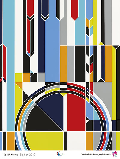
Sarah Morris - Big Ben 2012
Big Ben, a large clock tower in central London, is a landmark that the whole world recognises. If you showed a picture of it to a tribe in Madagascar they would tell you how it's situated in London, the land where the whole country stops to eat scones and drink tea at five o'clock sharp. So there's a lot of things Morris could've done with Big Ben to make it a stand-out landmark at the 2012 games. This is not one of them. If you showed this to the same Madagascan tribe they'd laugh at you then eat you for breakfast. Apart from the circle that slightly resembles a clock face there's nothing here that links to the world famous tower. All of the British class and history has been sucked away, which isn't great because those are two aspects that the event organisers wanted to highlight.

Bob and Roberta Smith - Love
You can tell that this poster is a joint effort because it's actually quite good; I really like the colours, the font and the fact it mentions the Paralympics. In fact, I'll even go as far to say that this is a good example of what a poster should be: it stands out amongst the rest, it tells you the name of the event it's promoting and it's simple and easy to read. Out of the words chosen, courage stands out the most to me because it's exactly what Paralympians needed to get through the adversity that their disability brought them, and then hone it to become someone truly unique.
After reading this 'critique' you probably feel like I'm being a little bit too harsh on the posters. These artists have won their acclaim through their own excellence and deserve every second of the limelight they receive, but I truly believe that I could make a better poster for the Olympic games, so I have:

Liam Garrahan - London 2012 Olympics, WELL DONE EVERYONE, GOOD SHOW
This is the best poster to promote the games: it's eye catching, it has national pride, it congratulates the athletes on the (correct-sized) podium, it says the umbrella name for the 2012 Olympics and Paralympics, and most of all it doesn't have the British flag on it because that would be deemed as not being politically correct.
Really liked this post!
ReplyDeleteAbsolutely ridiculous posters! :)
Top blog liam! Enjoyed reading it.
ReplyDeleteThanking you both! :)
ReplyDeleteLove all the posters, the are wonderful.
ReplyDeletefootball world cup 2014